Season 23/24 MAGAZINE
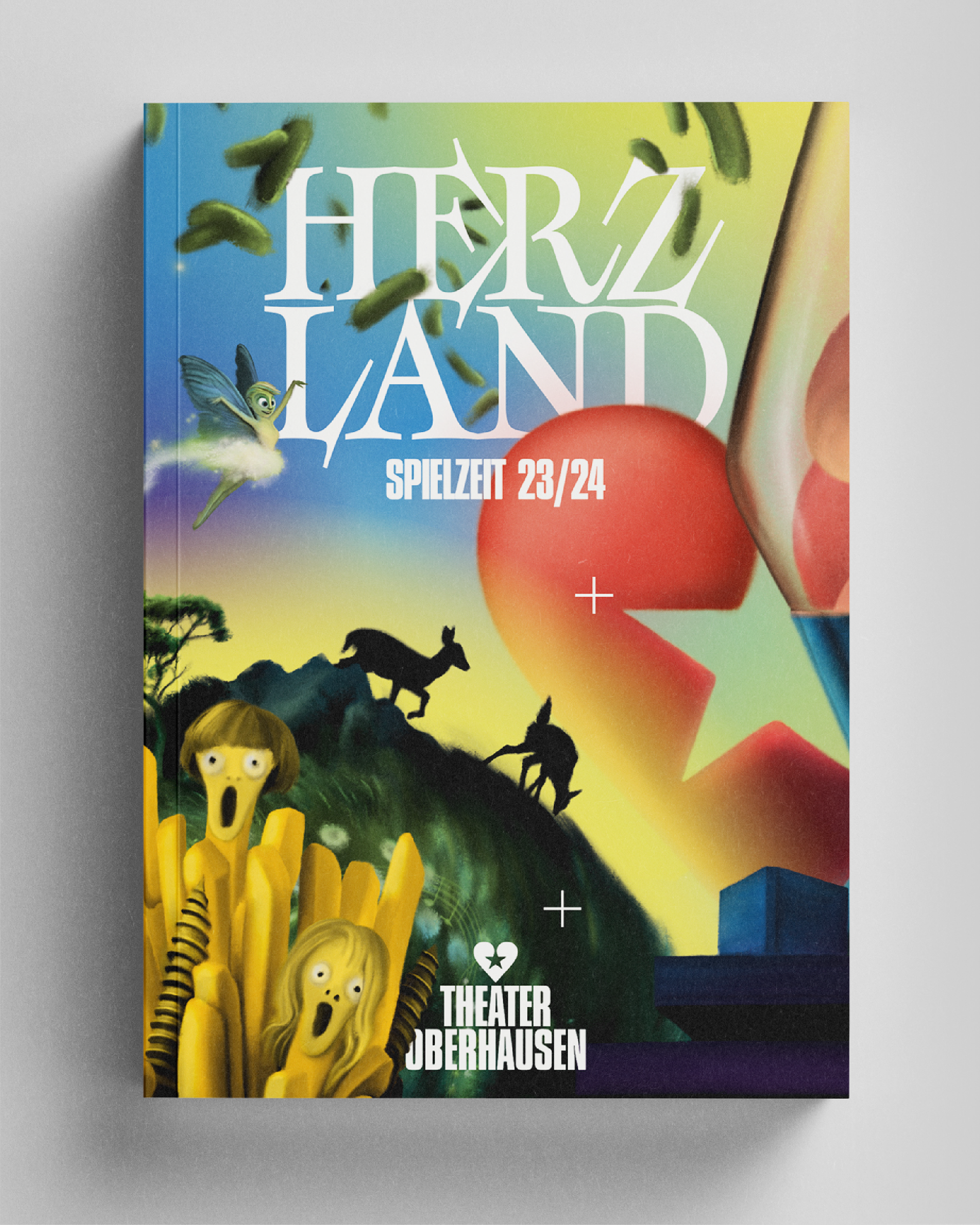
Herzland = Heartland = where the heart is at home
To give this profound but also very personal and ubiquitous concept a corresponding visual identity we drew upon a broad range of inspirations.
What is Heartland? Does it have borders, or laws, a queen or a king, a flag or an anthem?
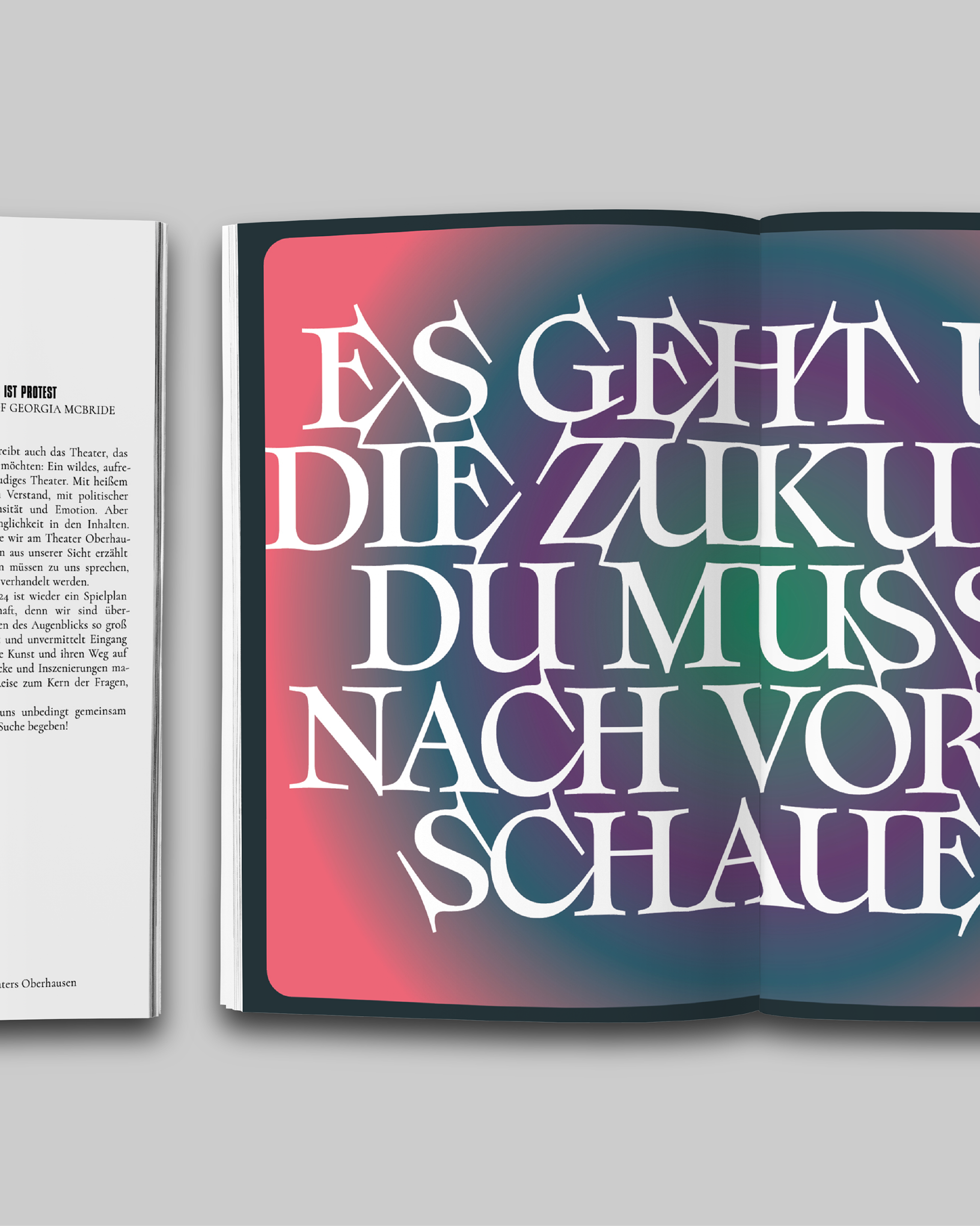
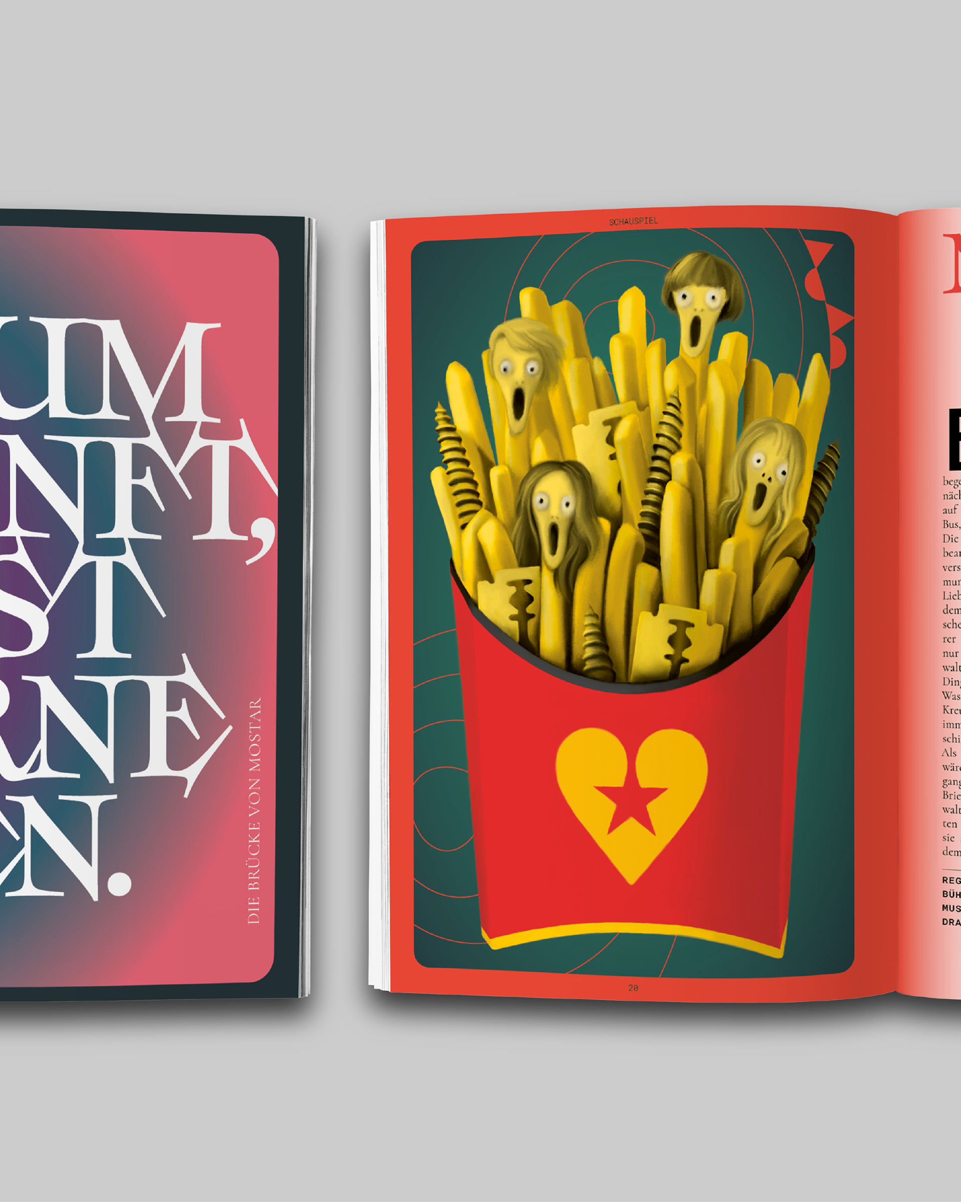
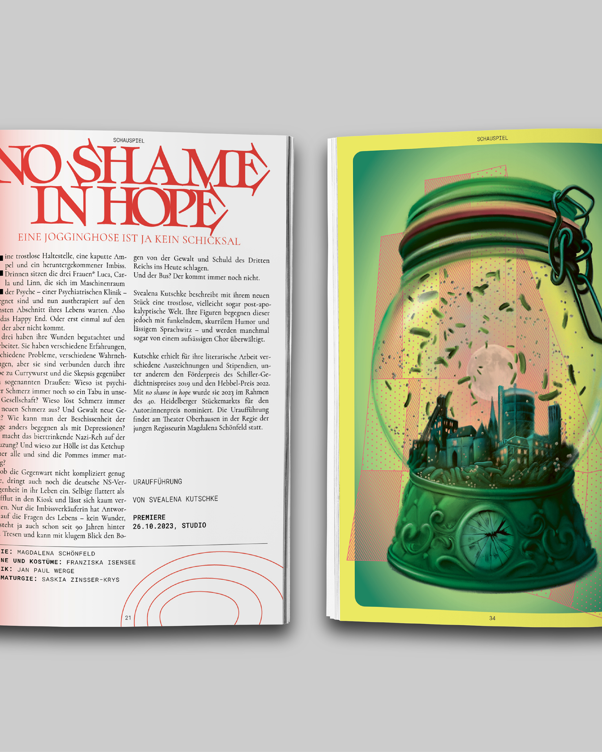
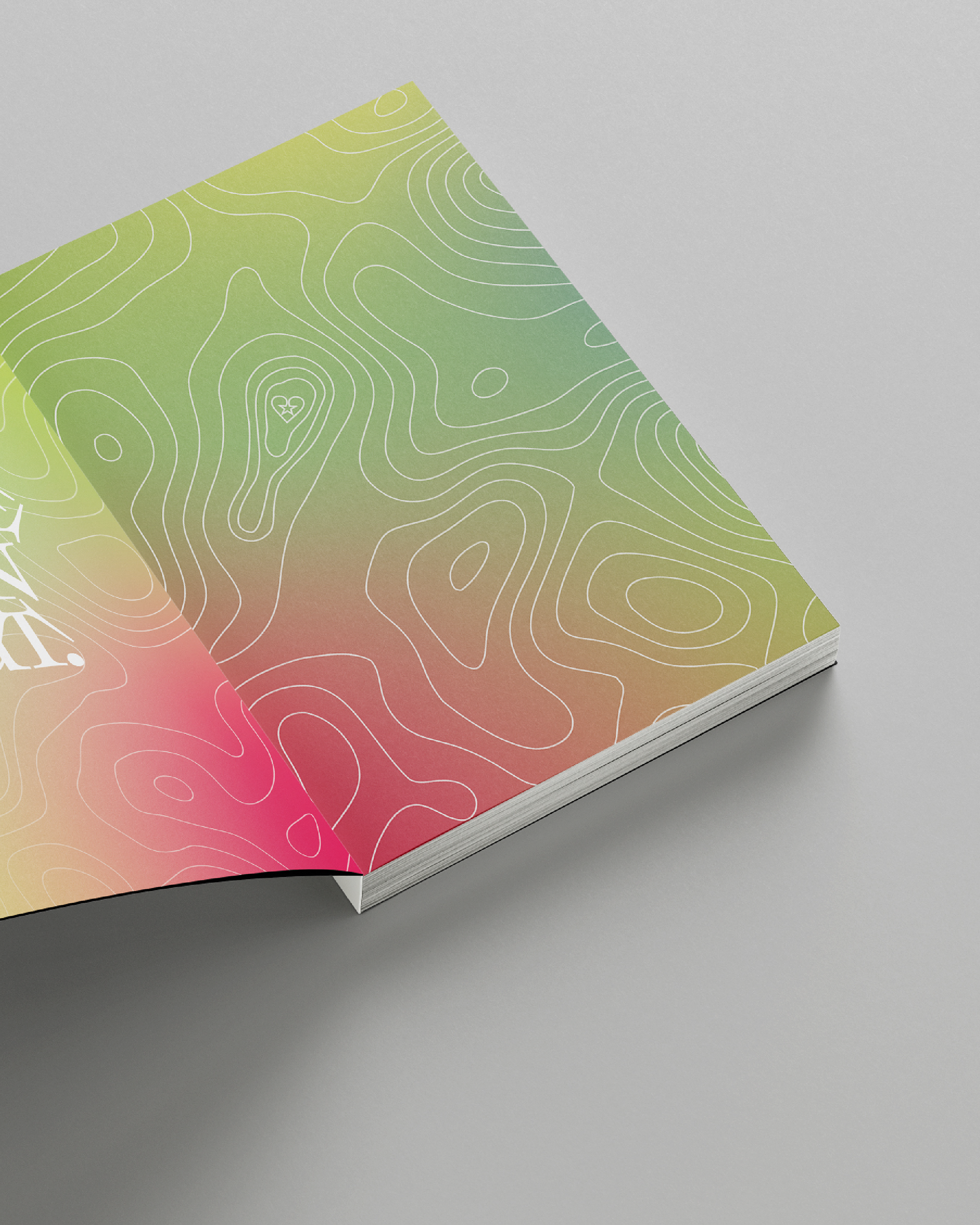
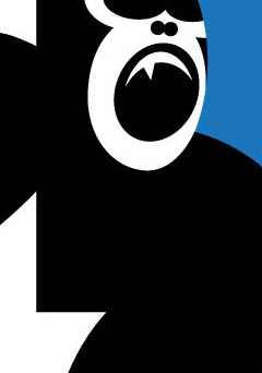
Elements that represent cartography and mapping are merged with vibrant color-gradients that represent transformation and fluidity, as well as with complex illustrations.
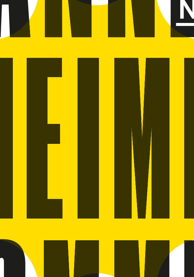
This visual synthesis shapes the look for the season, which takes cues from the previous season, both through the illustrative pieces, as well as the typography, to create an aesthetic relation.
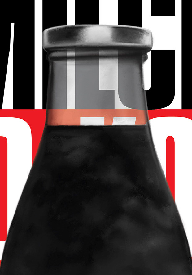
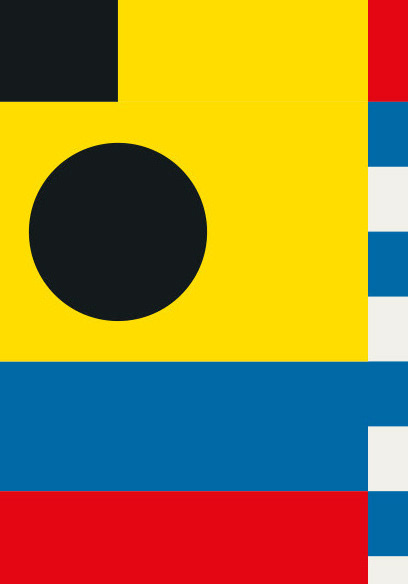
The graphics refer to the contents of the plays in great depth in order to generate unique and intriguing visuals that unfold little by little to be both introductory and impactful.